Hello there, I’m a designer who crafts solutions that not only enhance experiences but also drive conversions.
Christina Løvgreen
Senior Product Designer
(UX/UI)
From concept to implementation, I turn complex challenges and insights into tangible solutions—and abstract ideas (client: ‘Make it pop!’) into user-centered designs that balance creativity, usability, and brand consistency.
With 13 years of experience as a versatile Product Designer, I have elevated my expertise in e-commerce, data-driven design, and Design Systems.
#1: Product Enhancement
The Wonders of Variants
Matas has expanded its category range over the past few years. I can highlight a few focus areas: Parents & Children, Training, and Home.
Historically, Matas has shown variants only as individual products (except for a small range of make-up). You can imagine this was a complex task involving multiple teams, such as PIM and dedicated backend developers.
In collaboration with UX, we conducted extensive research and design iterations during the Discovery phase, keeping both technical constraints and business needs in mind. Our in-depth recommendation was shaped by workshops, hours of research, and user testing.
This product enhancement is prominently featured on both the PLP and PDP, where we prompt customers with a drawer to select their preferred variant.
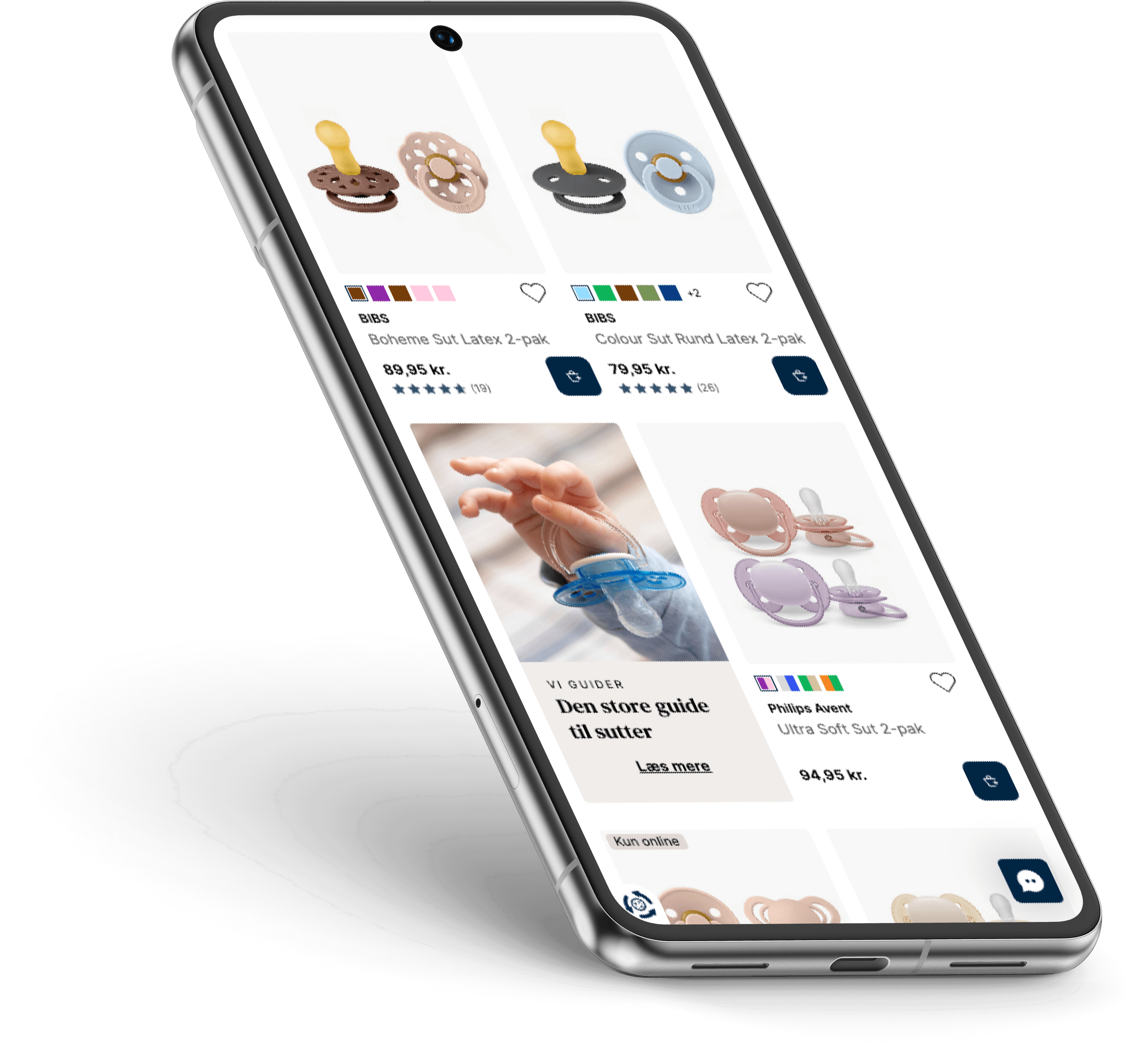
More visuals from variants right here
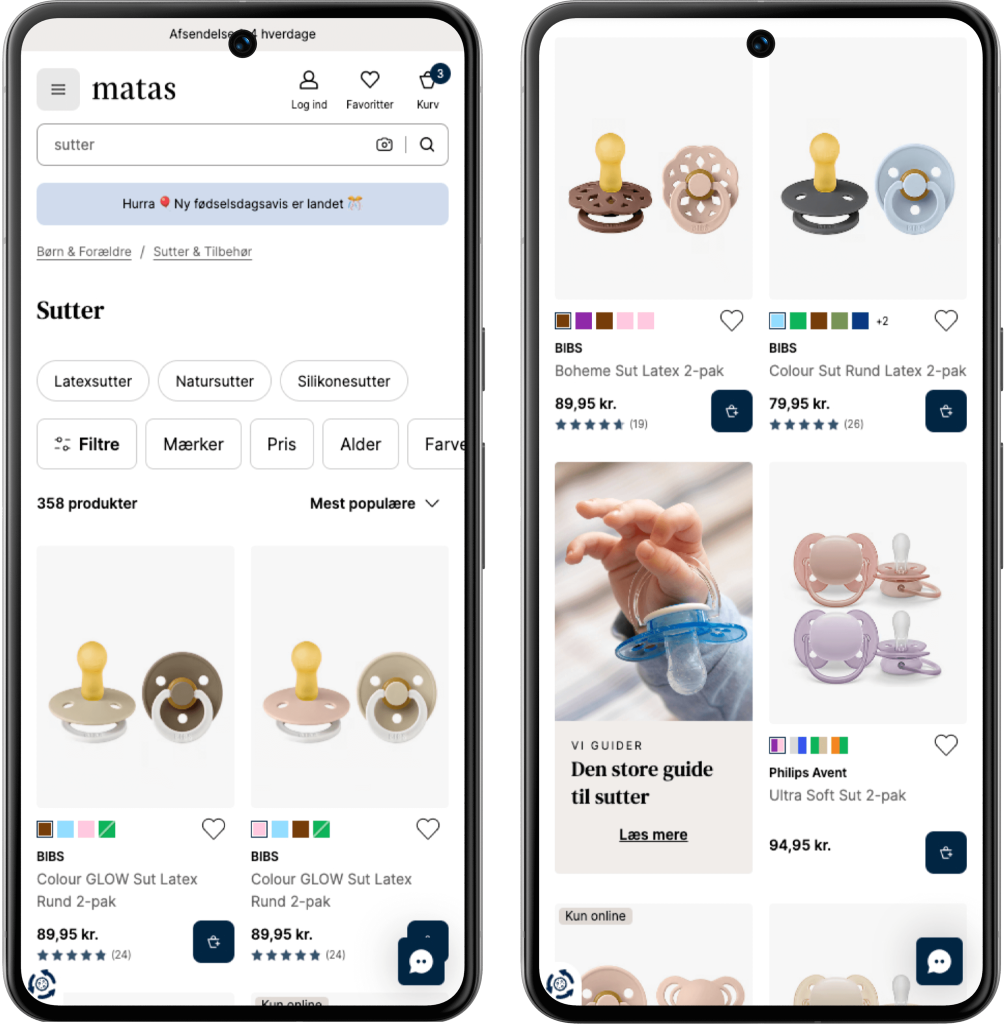
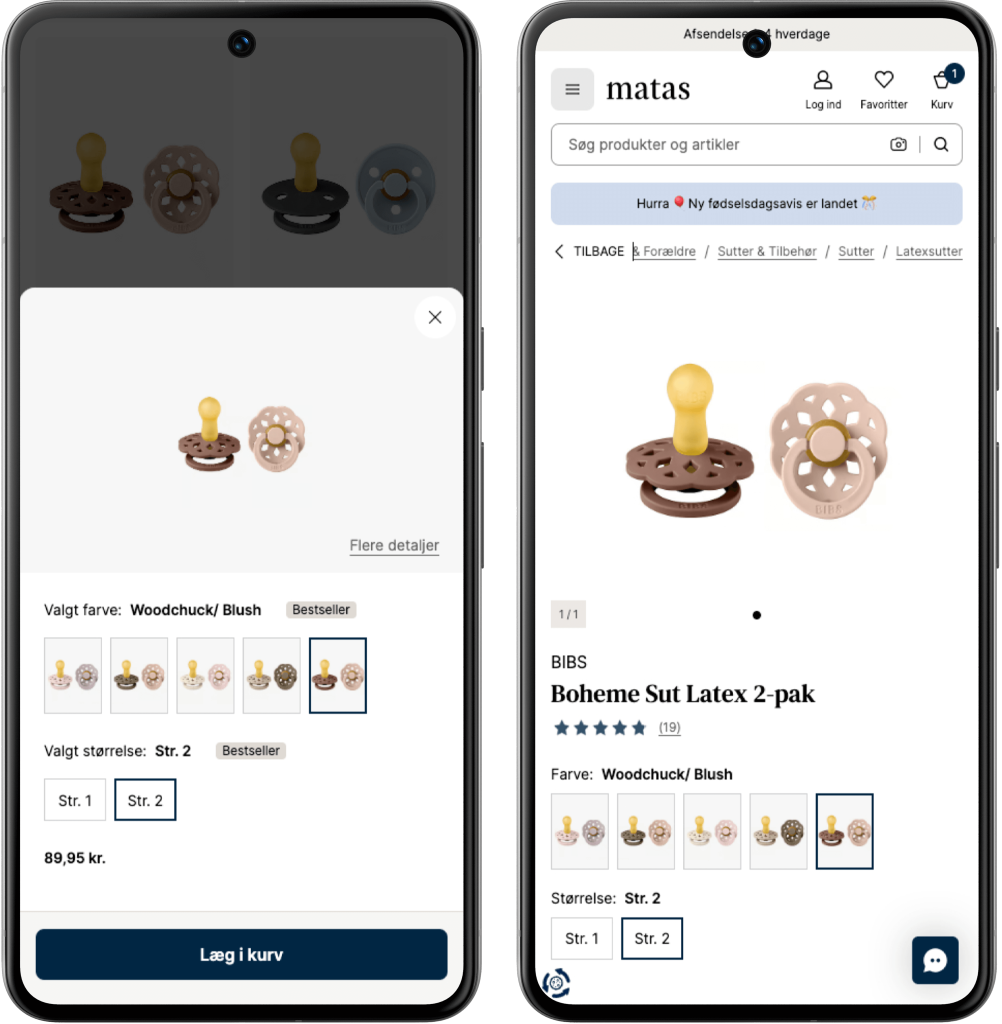
Flow Pacifiers PLP to PDP: Press the CTA (add to basket) on ex. Boheme Sut Latex 2-pak at the PLP, a draw opens with variant picker for both Color and Size. Press “Flere detaljer/More details” takes you to the PDP of the specific product.
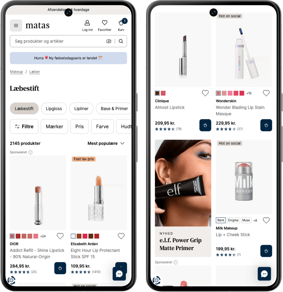
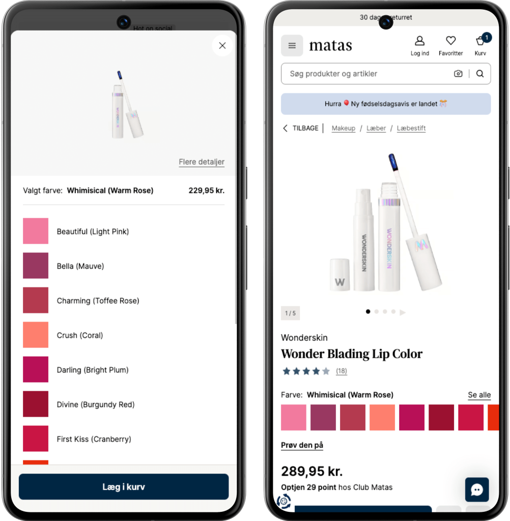
Flow Lipstick PLP to PDP: Press the CTA (add to basket) on ex. Wonder Blading Lip Stain Masque at the PLP, a draw opens with shade variant picker.
Press “Flere detaljer/More details” takes you to the PDP of the specific product.
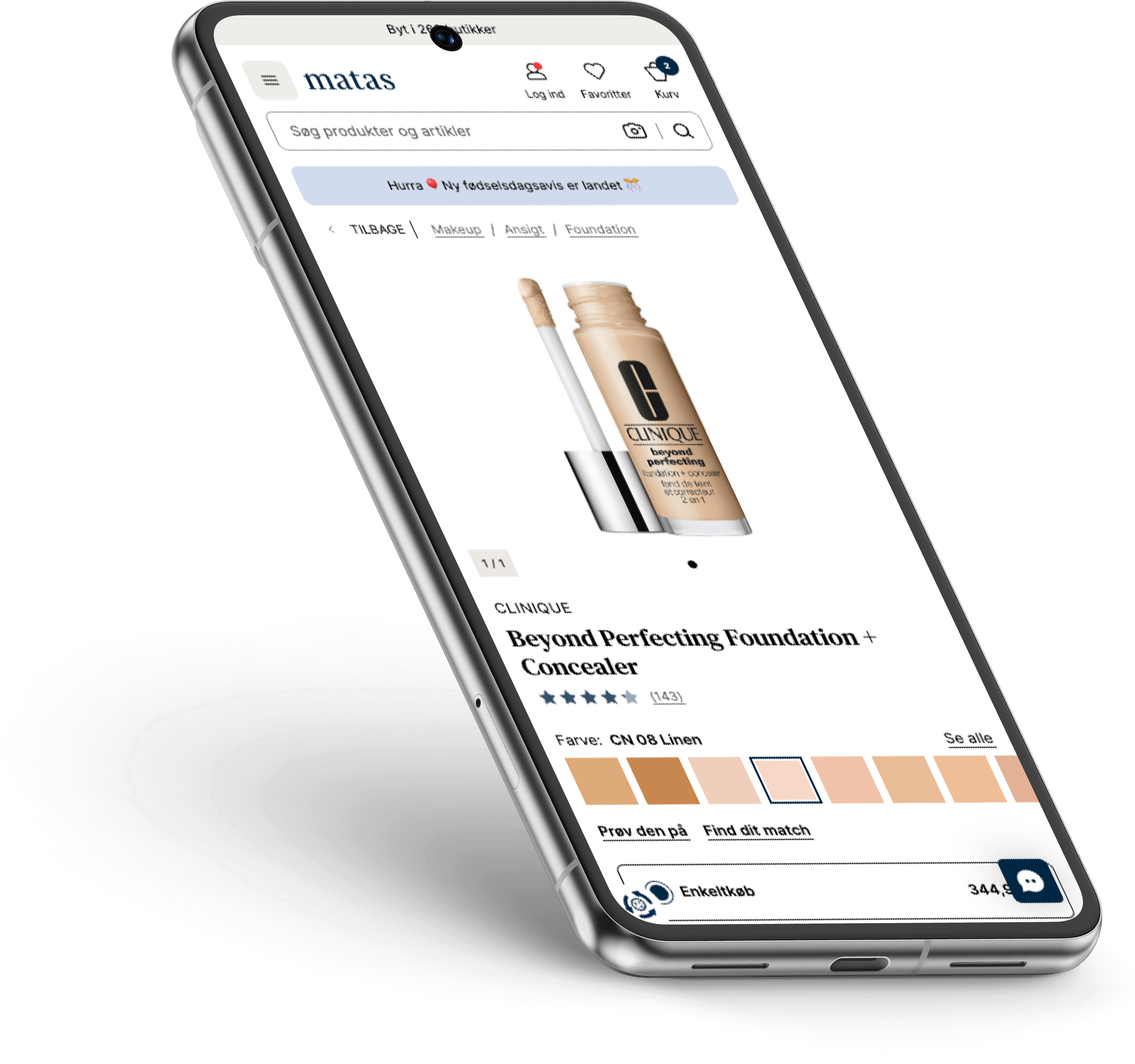
#2: Digital Tool
“Find your match”
(Find dit match)
Customers are often hesitant to try a new brand or purchase make-up online when the shade needs to be 100% accurate. To bridge this gap and reduce friction, we introduced a tool designed to build confidence in the selection process.
In three simple steps, customers can find the right shade by comparing the brand, product, and shade they already know and trust. Based on this input, a recommended shade is presented in the selected brand.
The third-party tool has been enhanced with a light and intuitive user experience, featuring a clear, step-by-step interface.
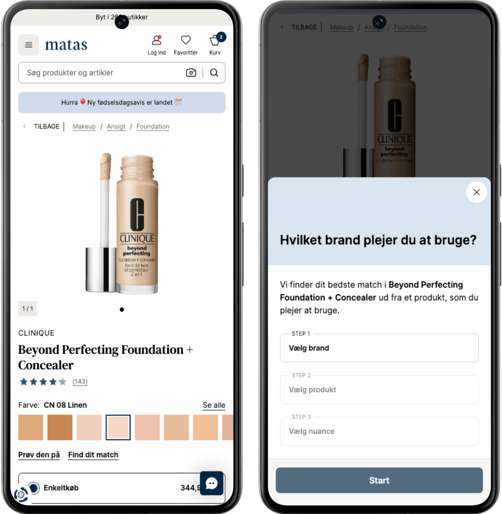
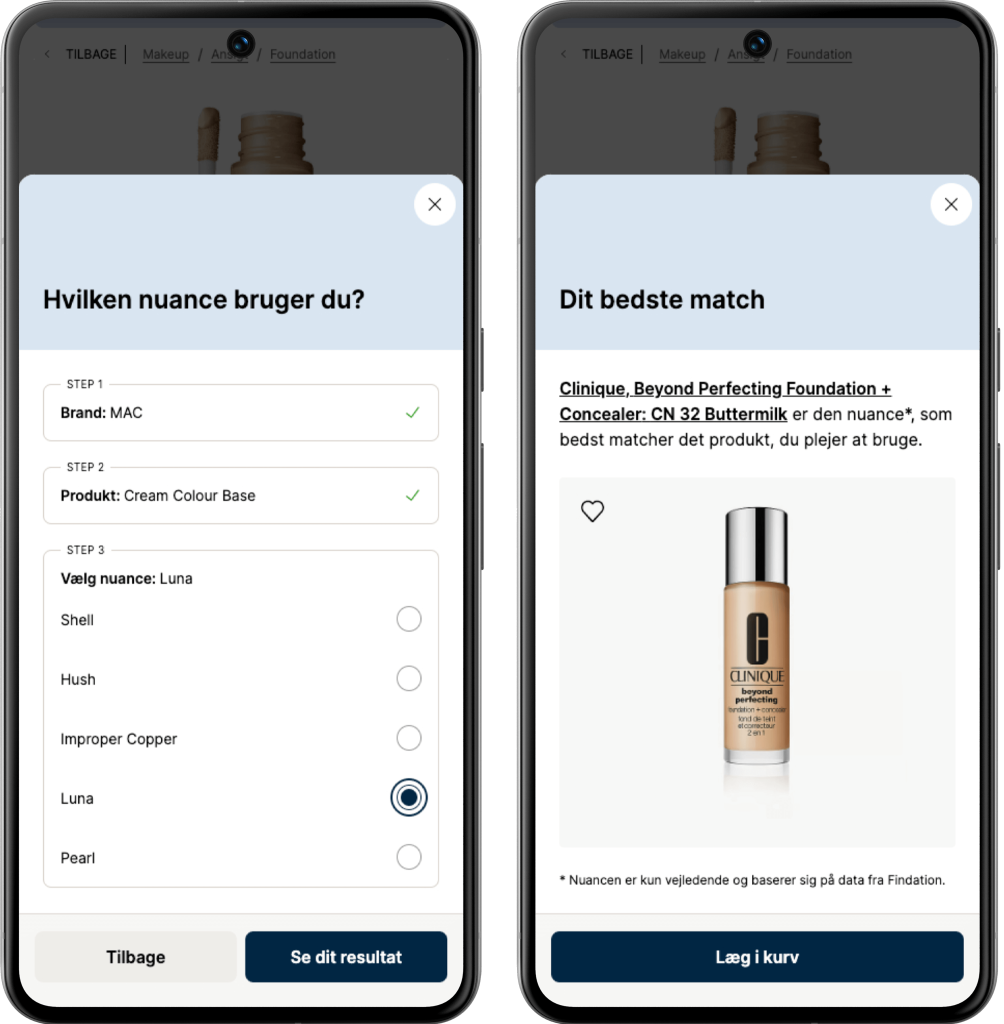
Flow: Find your match (Find dit match)
“Smooth brain” solutions often outshine the overly smart …
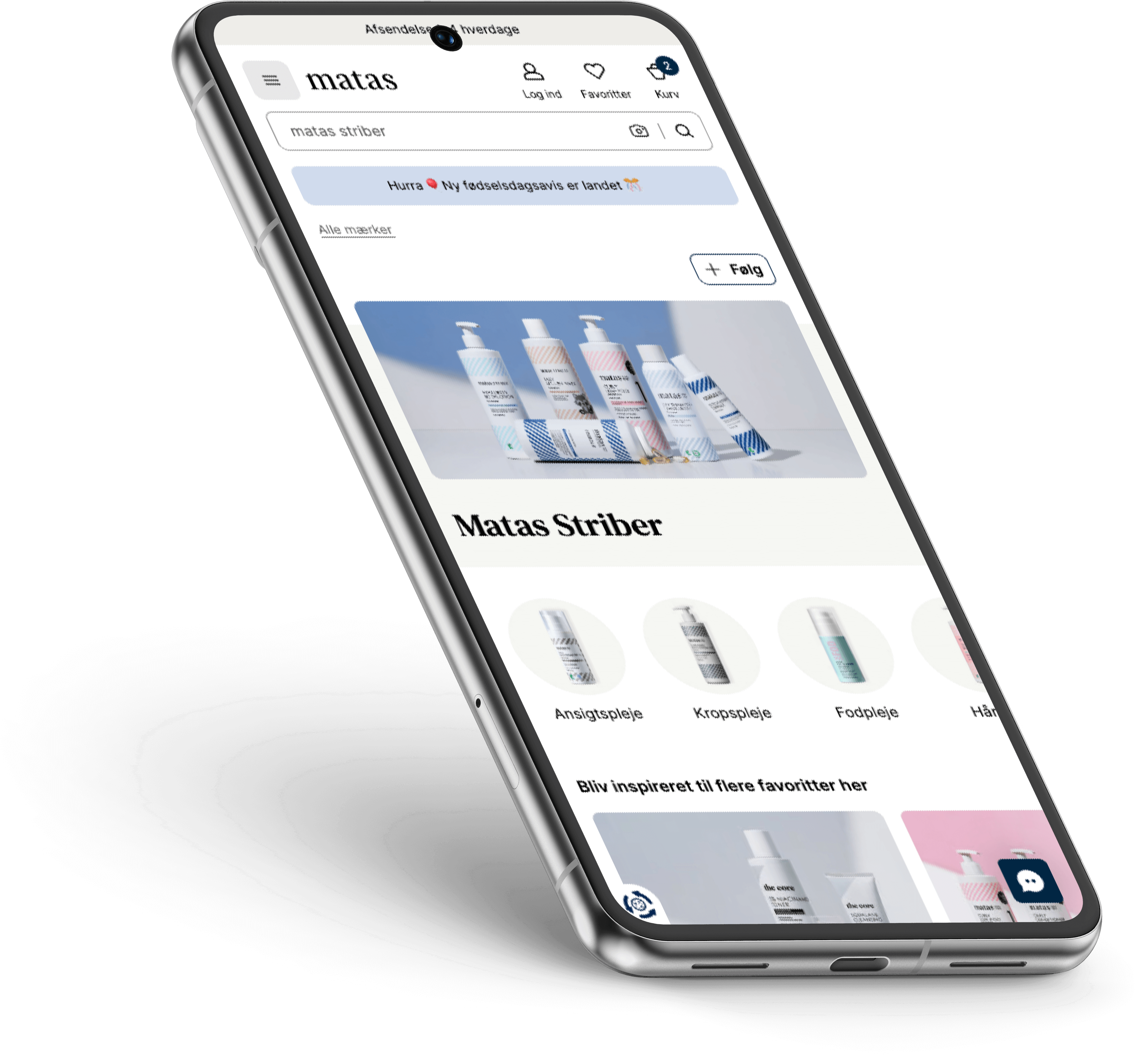
#3: “My Brands” Concept
How we gained 50% more followers across Brand Clubs
Members who follow a brand have a 35% higher basket size compared to those who don’t, within the same session!
This insight sparked the rollout of a “Follow” concept across multiple touchpoints to engage and encourage more members.
Surprisingly, test and data revealed that the receipt page was where customers found the feature most relevant. Allowing them to claim their purchase amount toward progress for a gift from that specific brand.
Since launching the concept, we’ve seen a 50% increase in brand followers compared to the same time last year.
More concept touchpoints
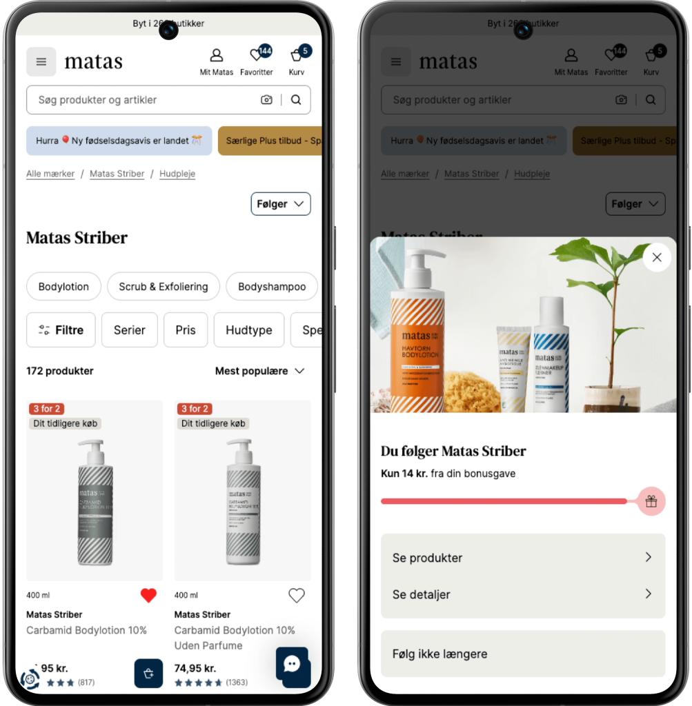
Screen 1: On a specific Brand PLP we display the “Follow/Following” button (the exact same for PDP in the product details area).
Screen 2: When pressed “Following” you now see a draw with informations on your progress, more details and possibility to unfollow.
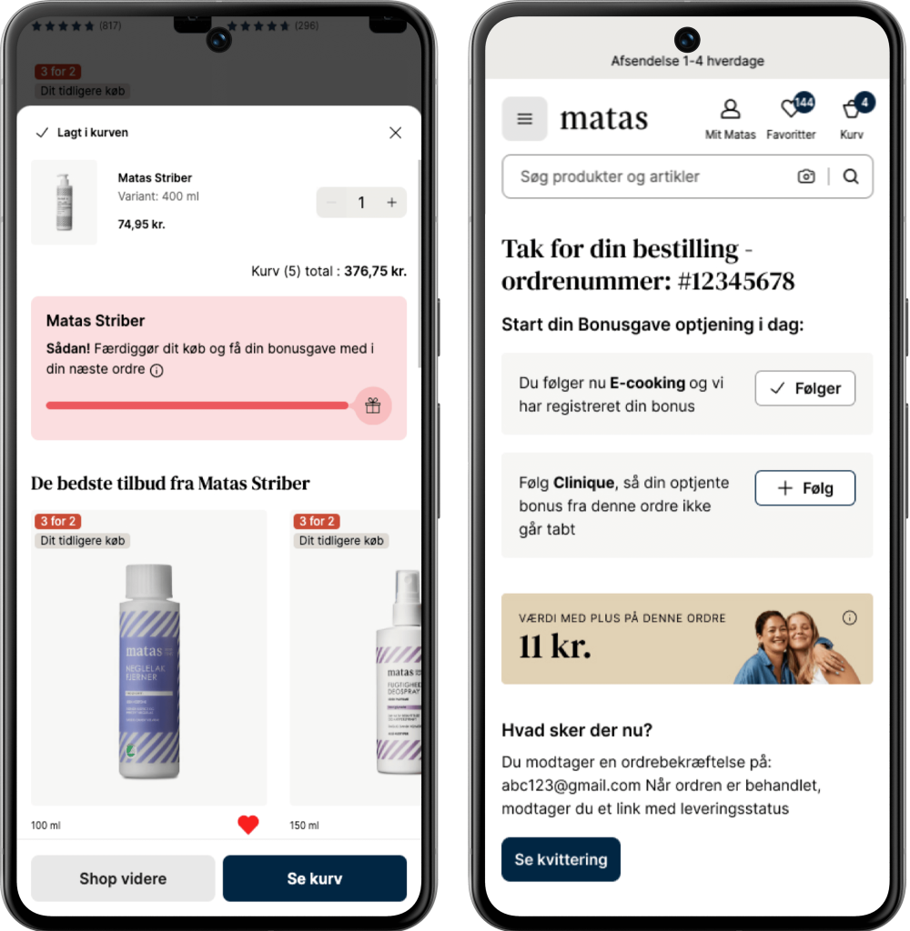
Screen 3: When adding a Matas Striber product to your basket a powerstep with your progress appears.
Screen 4: On the receipt page, as mentioned, we display brands you don’t yet follow but bought products from in your current order.
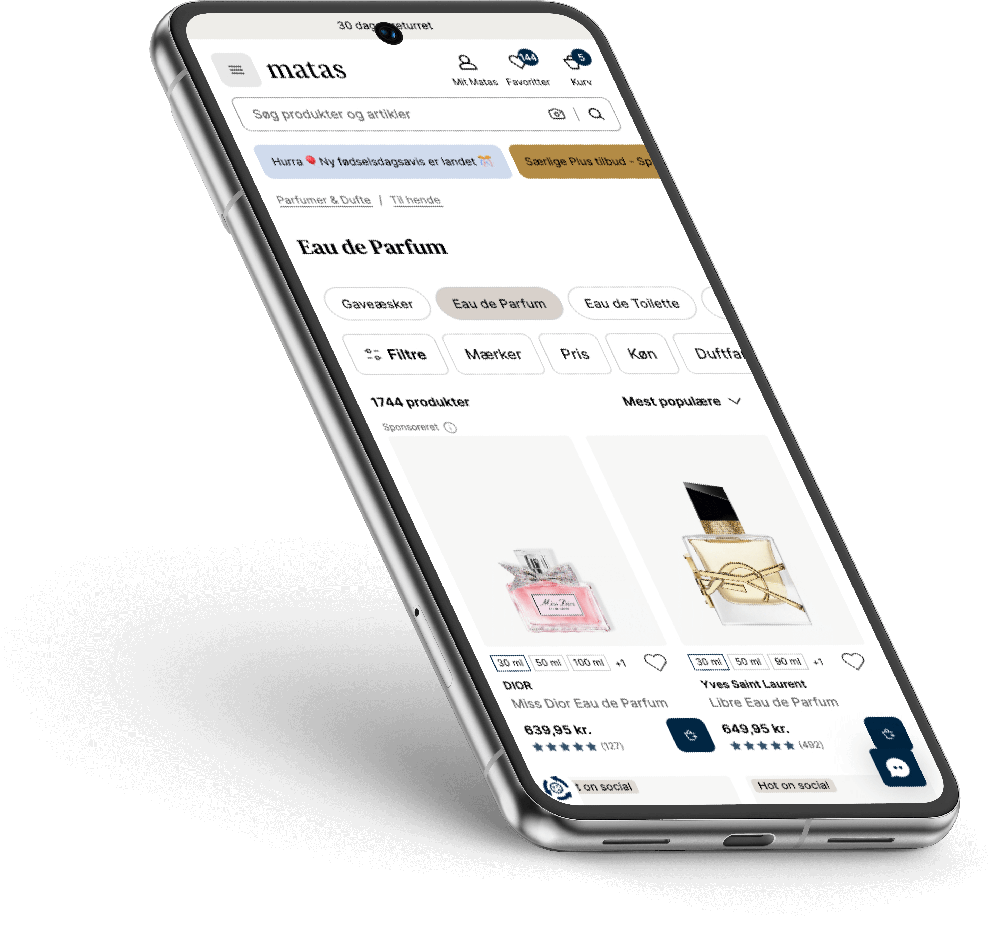
#4: Core Feature Enhancement
Seamless Filtering on Heavy Product Landing Pages
As product data improves from supplier to PIM, we now know much more about our assortment—and of course, customers should be able to benefit from that.
To prevent customers from drowning (and giving up) on a PLP with 11,749 products (but hey, who’s counting?), we introduced an enhanced, refined, and optimized filter pattern.
We ran extensive tests and research to see just how far we could go in simplifying, hiding, or removing elements—without compromising the user experience.
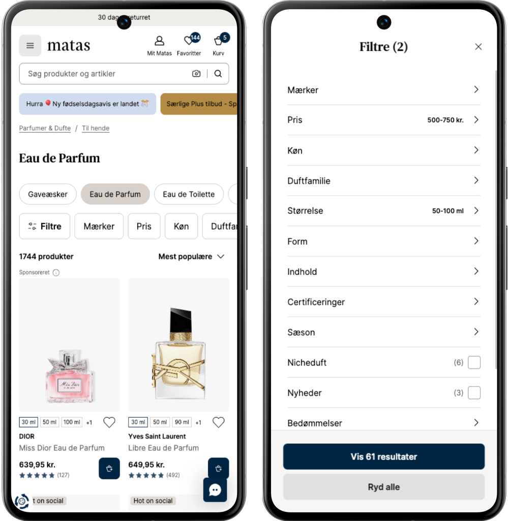
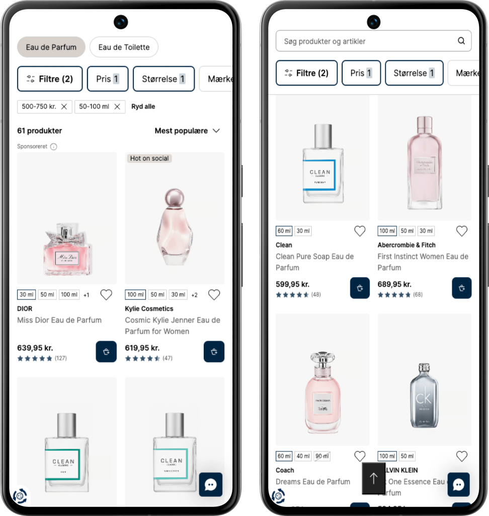
Filtering an Eau de Parfume for her PLP on ex. Price and Size, the last screen is an example on how it behaves if you scroll down the PLP and then decide to scroll up again, then we display search/filters and a “up” helper at the bottom of the screen.
Good UI is clear.
Great UI is invisible.
Resources
User Interface Design
User Experience Design
Figma Expert
WCAG Responsible
Design System Advocate (build/craft/scale)
Prototyping
Partnering in business & strategy
High customer empathy
Holistic perspective
Excessive technical insight
Basic CSS/HTML
Shape and optimize processes
Project Management skilled
Usability Audits
Testing before rollout
Highlight #1
We went to San Francisco to join Figma Config 2024
Three Design colleagues and myself went to San Francisco (CA), to experience the vibe and knowledge of Figma Config. And what a journey – definitely leveled up my ambassador hype 🔥
Inspiration and new perspectives
That Rally feeling with 8.000 attendees, Wow. The conference provided me with inspiration and new perspectives on topics, which are essential for my professional era as a UI Designer, such as ‘Scaling Design Systems’ and ‘Enhancing designer and developer collaboration’ 🙏
Coming home with three main goals
🚌 Undertake a deep dive on how we should leverage the tools Dev Mode and Code Connect more extensively, to optimize and have an even more efficient collaboration with developers.
✅ Discuss the strategy and insights, map out the Design Systems core promises, identifying where they fall short and exploring ways to improve
✅ Update our stakeholders on the key findings and highlights we were enlightened with at Config, from a Design thinking perspective to a more strategic Business aspect.
Virtual is always free
Highlight #2
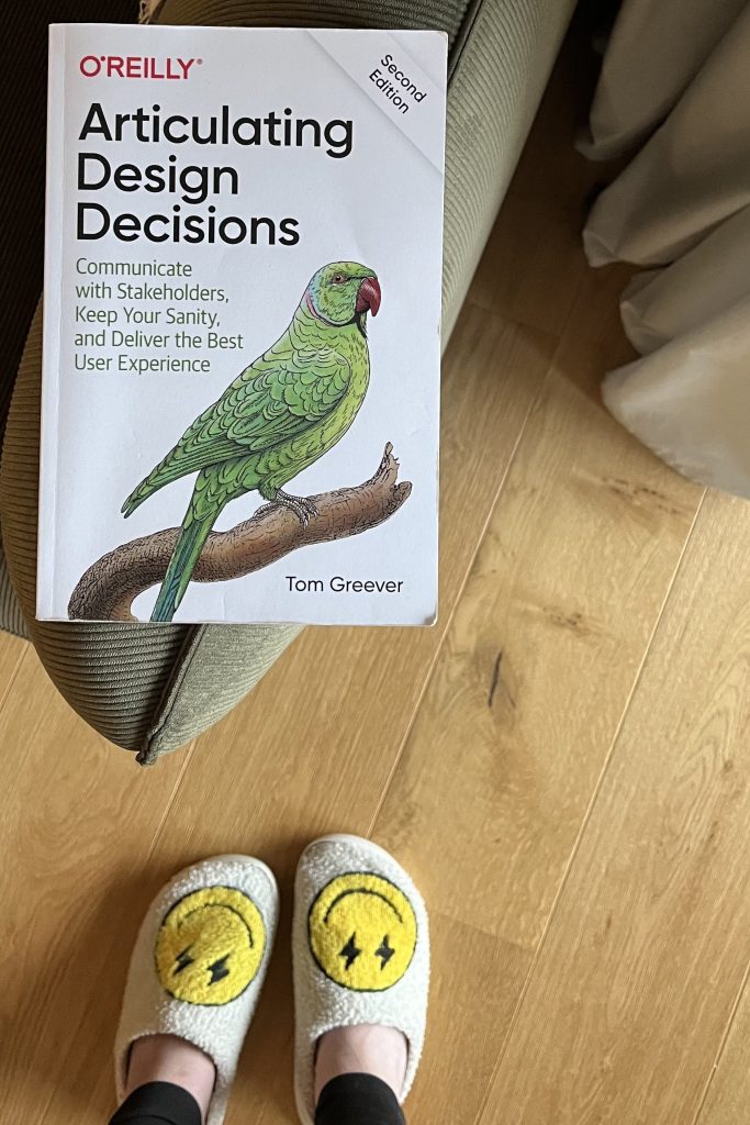
“Communicate with Stakeholders, Keep Your Sanity, and Deliver the Best User Experience“
By Tom Greever
This is a significant book for me, one that has shaped how I communicate and empathize with different stakeholders
—and in my personal life as well.
Espresso Your Ideas with Me?
I’m excited to explore new opportunities
– feel free to reach out 🪐